
Look of the Day
Look of the Day
My Role: UX + UI Design
Social Media Art Direction + Campaign Design
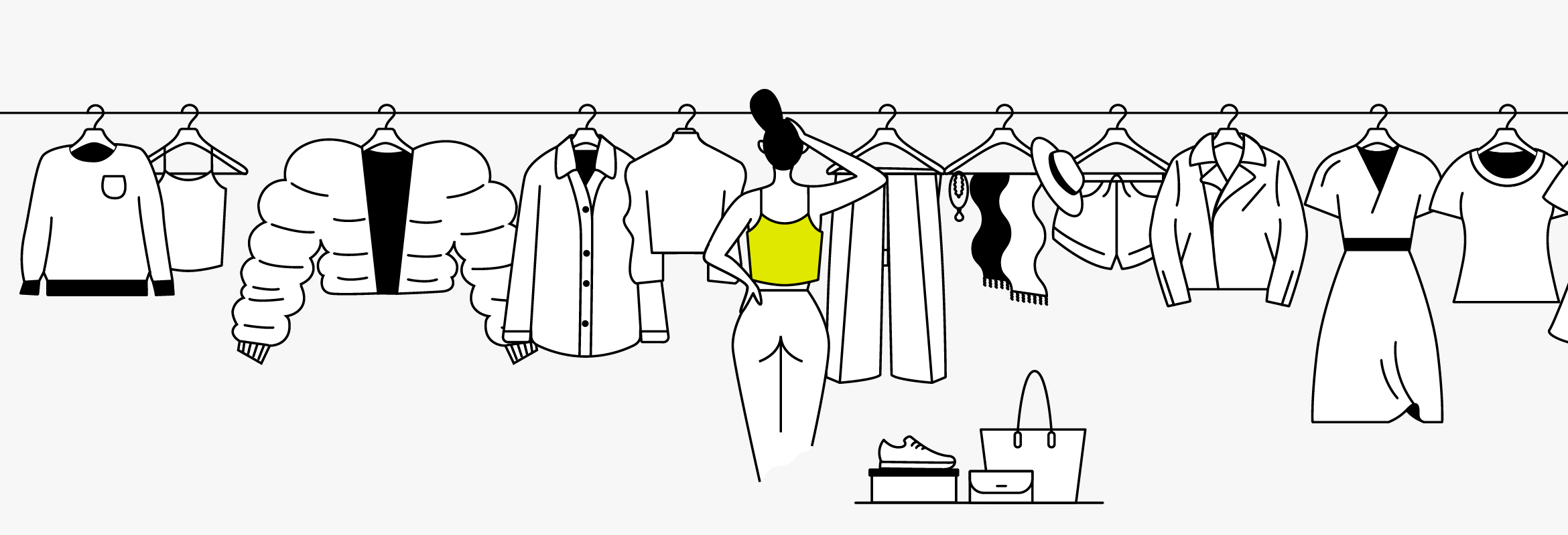
Simple everyday decisions can be challenging to make and waste a lot of time.
Deciding what to wear is one of those simple decisions that always seem to turn into a big choice. Through design thinking and going through the UX process, I designed a product that can help users decide what to wear quickly and confidently.
STEP 01:
Understanding the Problem.
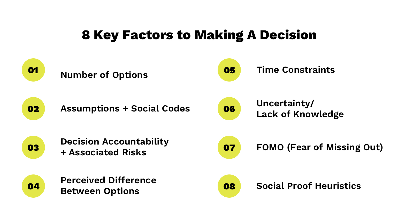
To better understand the problem, I performed secondary research and conducted a competitive analysis of 3 products that help users make decisions. My research can is summarized in the 8 Key Factors of Making a Decision.
STEP 02:
Understanding the User.
Target Audience.
21-50+ years old
Has a daily routine
Feel either confident or somewhat confident in their decisions
Decides in a few or 10+ minutes
When making a decision, they value at least one of the following:
Their gut
Online recommendations
Friends/family opinions
Number of options
Flexibility of decision
Knowledge of all their options
Struggles with one of these 3 decisions:
01. What to Wear
02. What/Where to Eat
03. Whether or Not to Exercise
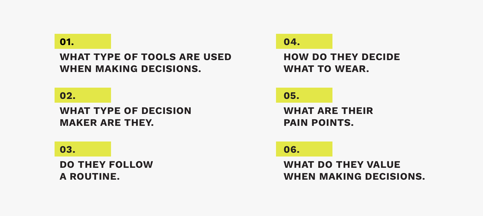
User Interviews.
The next step was to conduct interviews with 5 participants selected from the Screener Survey. After the interviews, I created an affinity map where 6 themes surfaced.
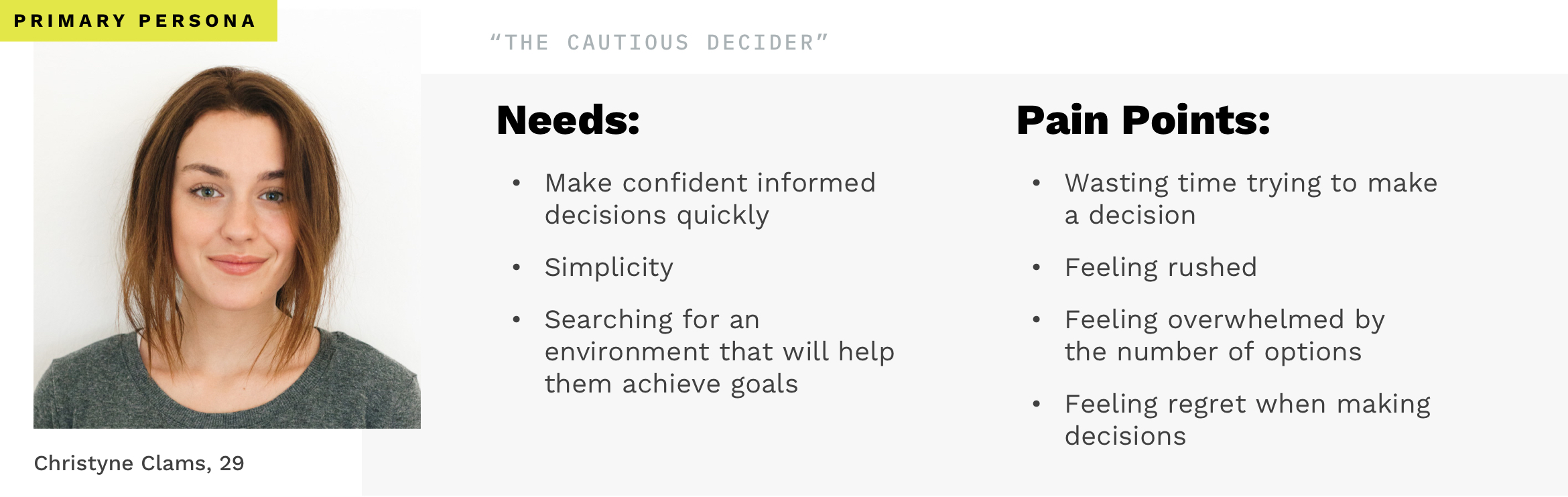
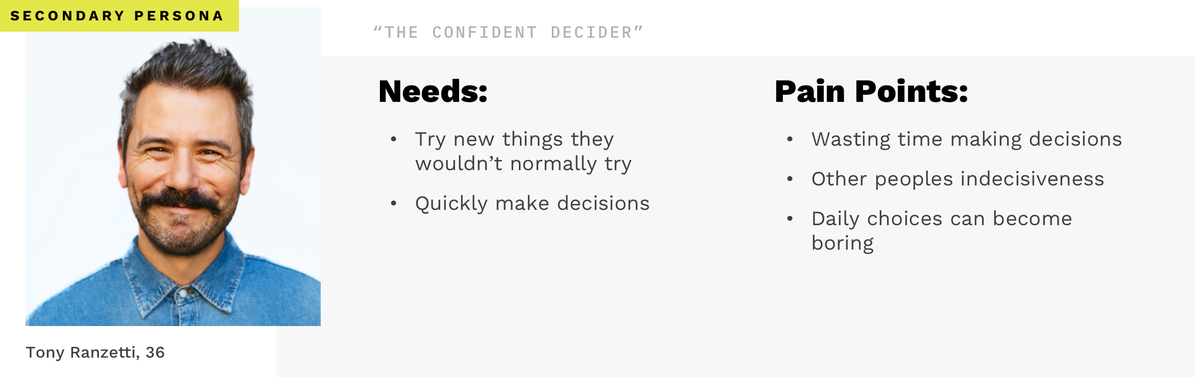
User Personas.
I then took the data from my interviews and formatted it into empathy maps, which eventually developed my primary and secondary user personas.
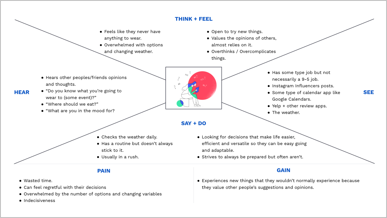
User Type A Empathy Map
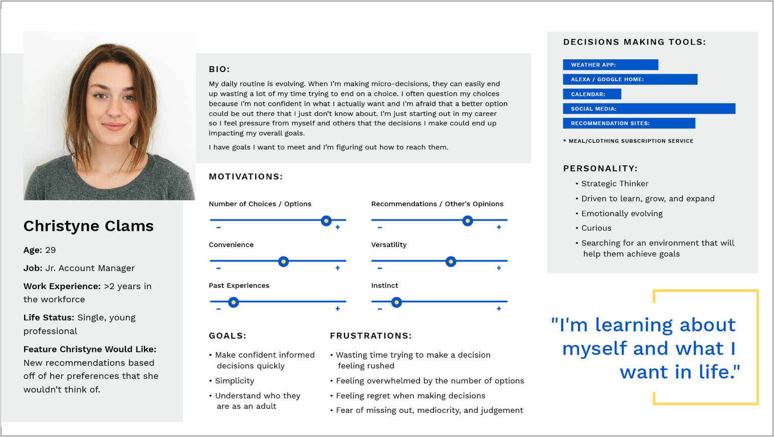
Primary User Persona
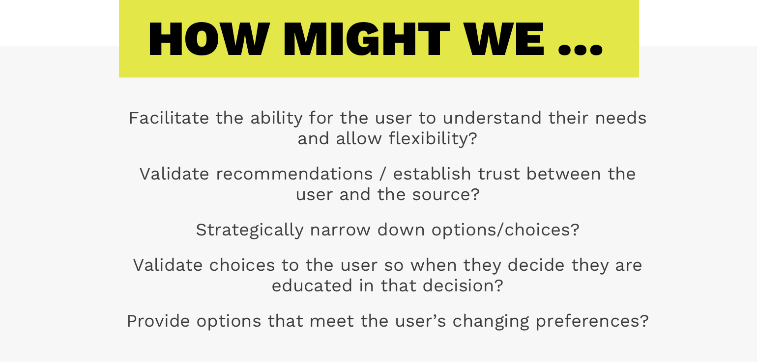
How Might We.
I further narrowed down the problem by reformatting the problem into 5 “How Might We” statements.
STEP 03:
Ideate.
User Stories.
Continuing with the design thinking process,
I began to ideate solutions to my problem and the specific HMW statements.
Basically, I brainstormed a ton of ideas.
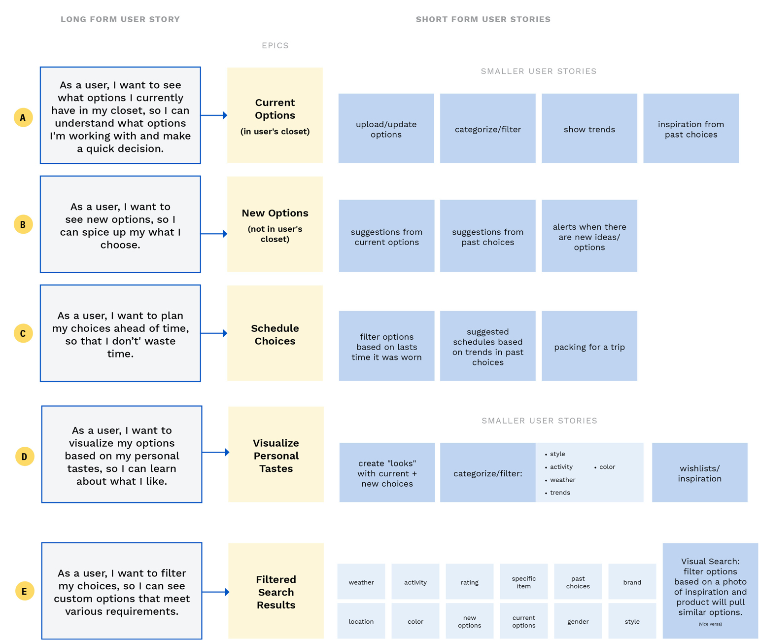
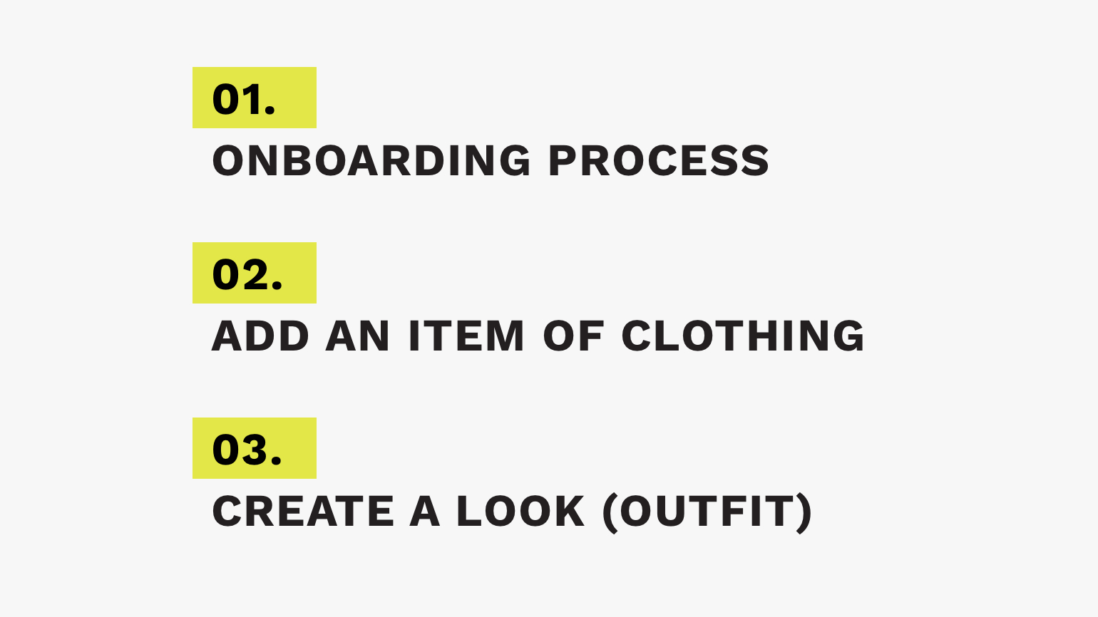
My MVP.
I analyzed my 5 epics and the smaller stories that made them up and determined that my product needed to have 3 tasks that are vital to solving the problem: all these tasks allow the user to visual their personal tastes and options, which I decided is the most important feature.
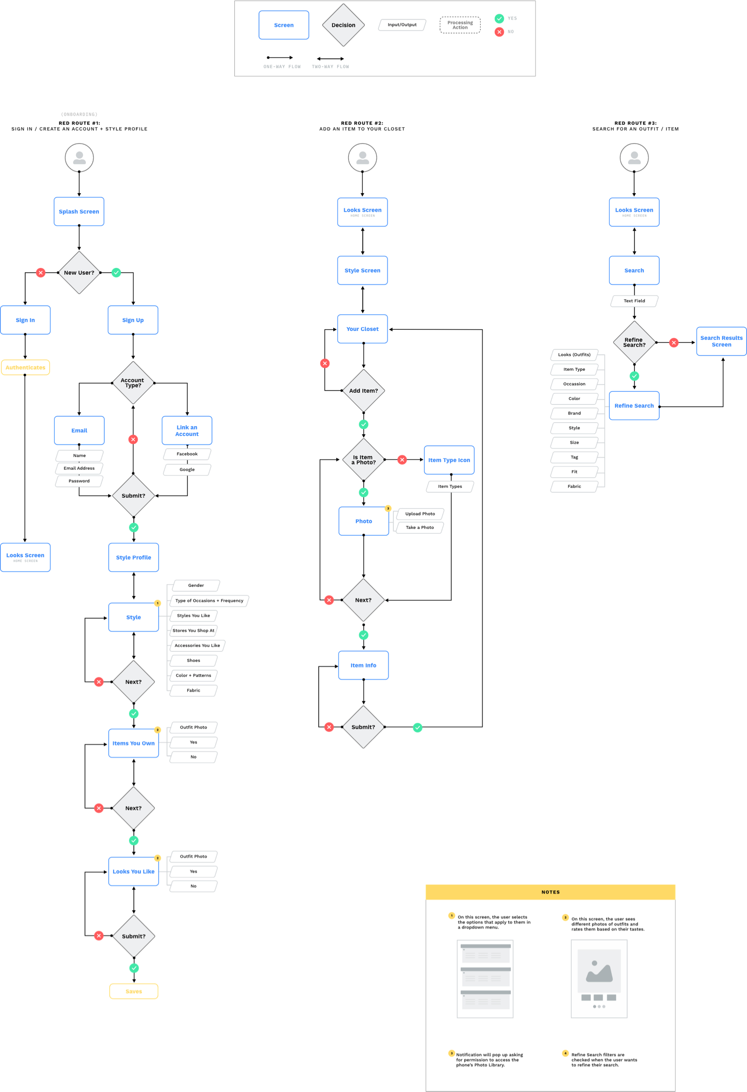
User Flows.
Next, I mapped out the 3 critical tasks (red routes) based on how the user would encounter these tasks in the product.
This ensures that I am not missing any essential information and that the steps and decisions that lead up to success make sense.
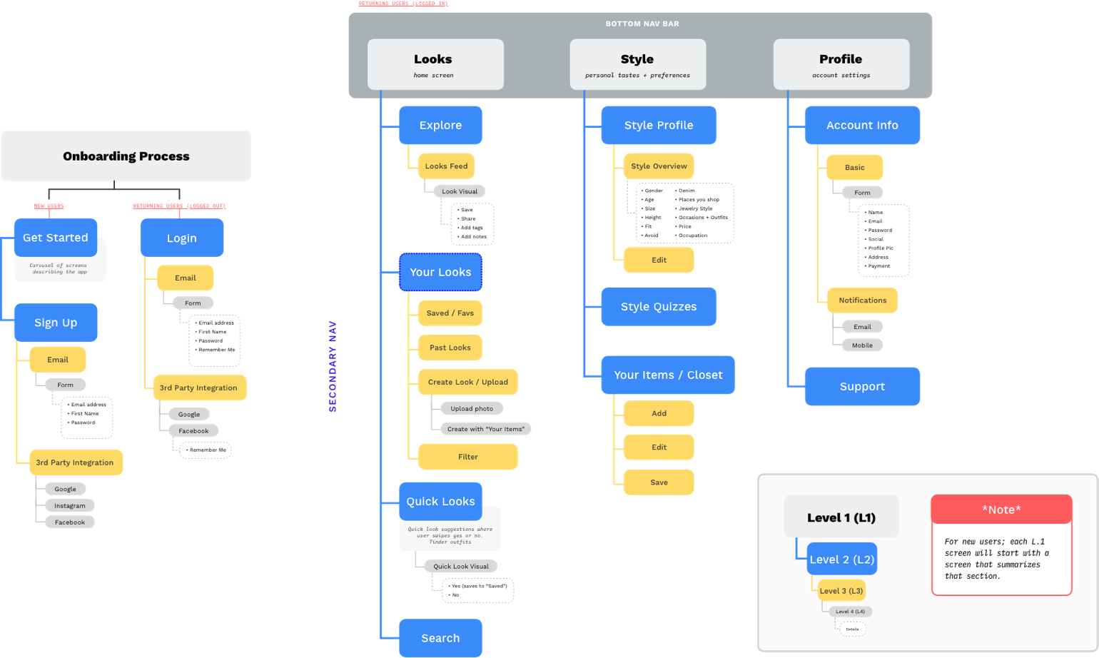
Information Architecture.
The sitemap is another visual representation
(a birds-eye view) of the organization and hierarchy of the product.
STEP 04:
Sketches + Guerrilla User Testing.
Sketches.
Now that the organization and intended interactions and flows were decided, I began to sketch out the bones of the product.
I decided my product would be an app because it’s easy to access when the user needs to decide what to wear.
The sketching phase began as all good sketches start; paper and pencil.
Guerrilla Testing.
I used the POP prototyping tool Marvel to quickly test how participants responded to the layout of information.
During the test, participants spoke aloud what they thought while they executed the 3 red routes.
Wireflows.
Now that I had insight into how my users were thinking while interacting with a sketch prototype, I created wireframes and wireflows.
These were used as the foundation or skeleton of my final product.
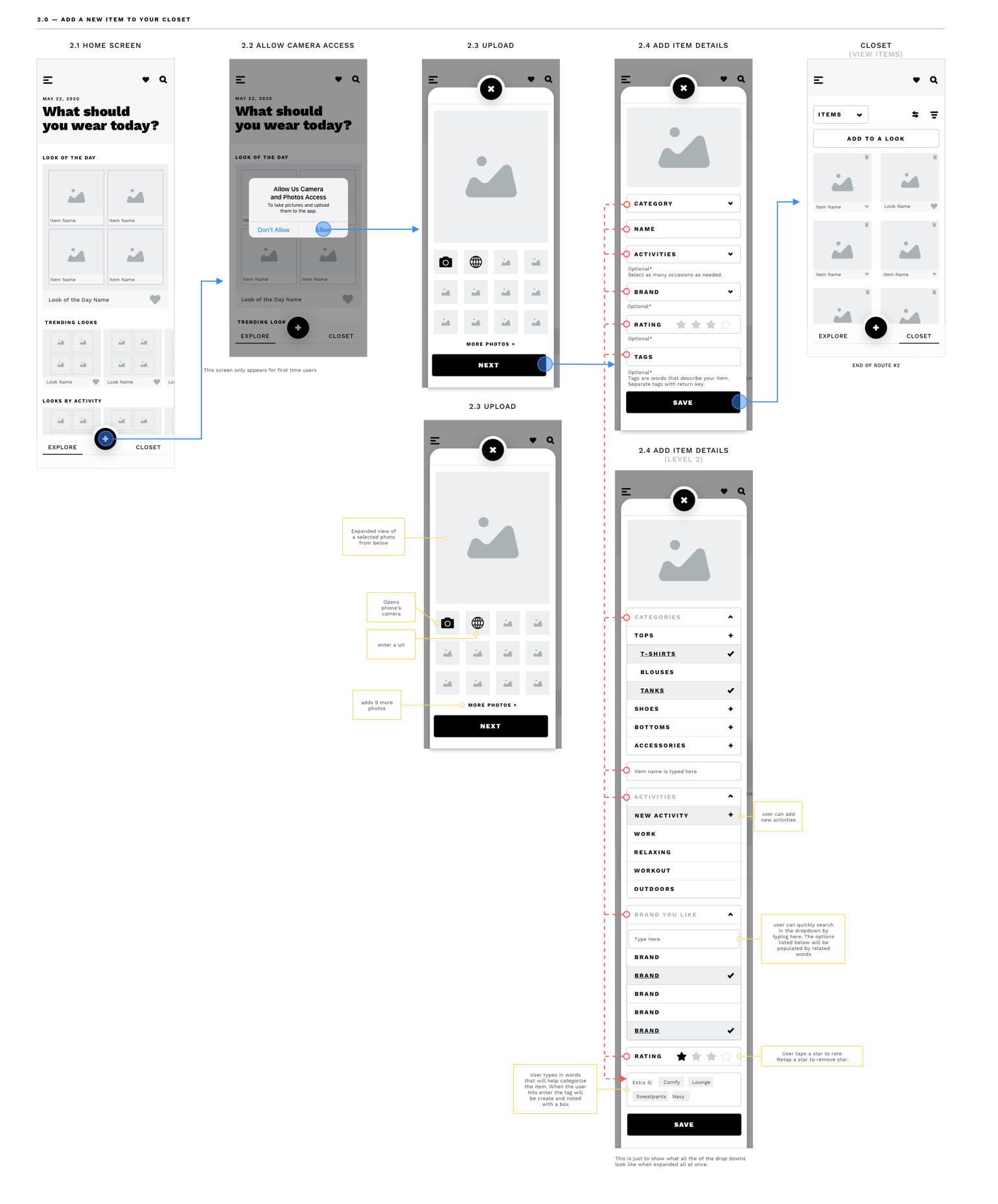
Here is an example of the Red Route #2 wireflow. In total, I had designed 12 wireflows.
STEP 05:
The Design.
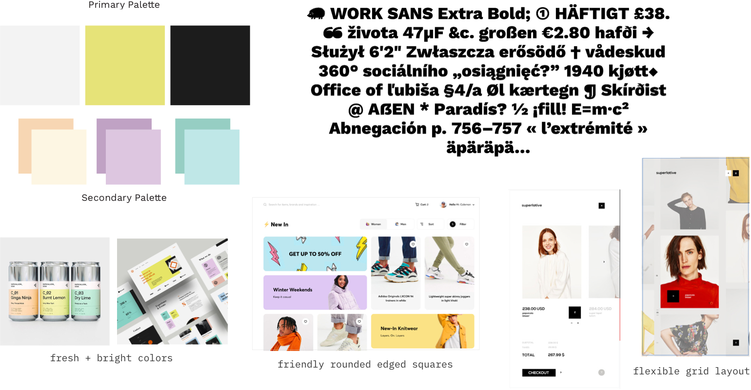
Moodboard.
My moodboard process involved gathering inspiration from some of my favorite interactive studios and creating a collection of inspiration. The moodboard defines the key visual design decisions that I made.
High-Fidelity Designs.
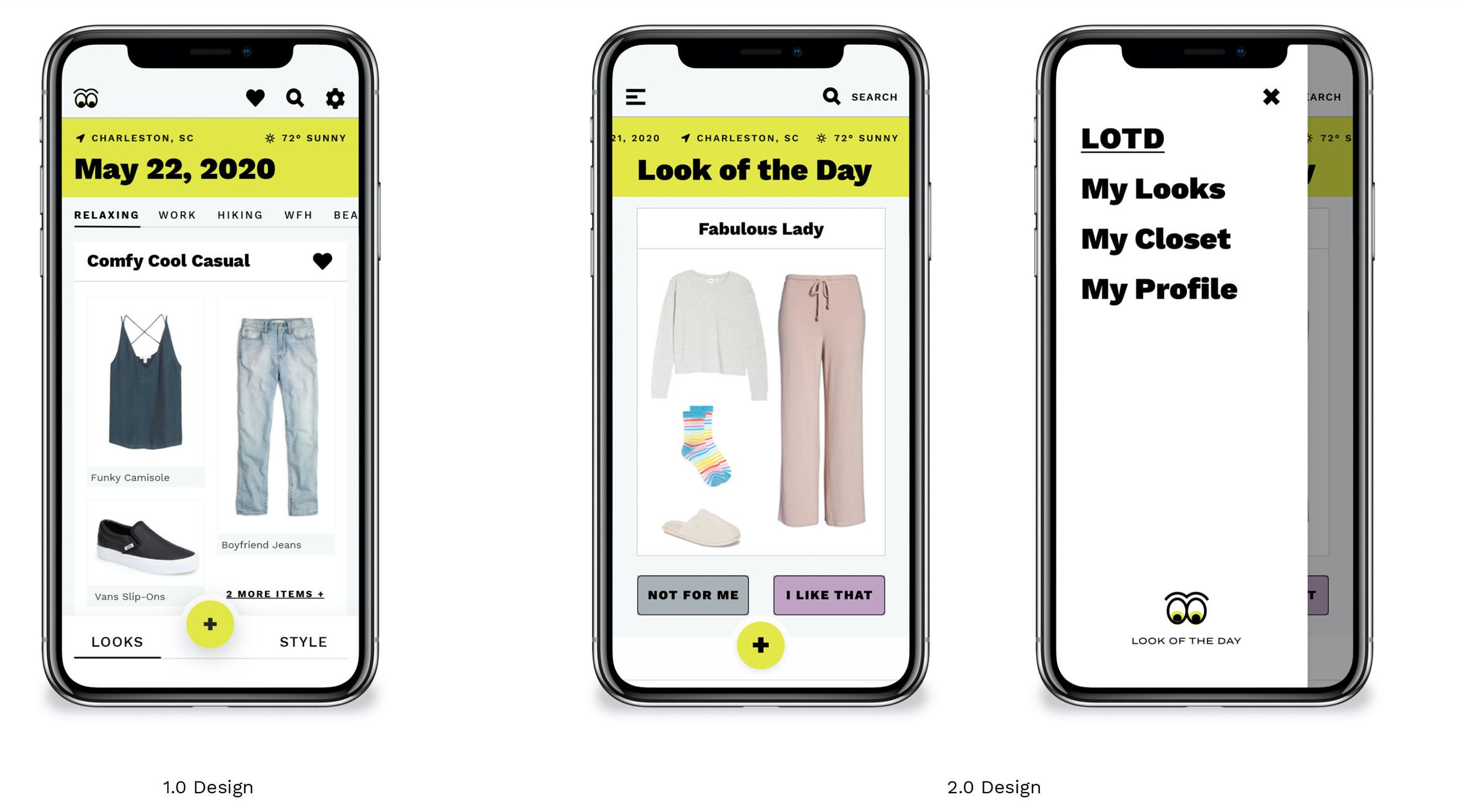
The high-fidelity designs take the design decisions from the moodboard and implement them into my first iteration of a prototype; Prototype 1.0.
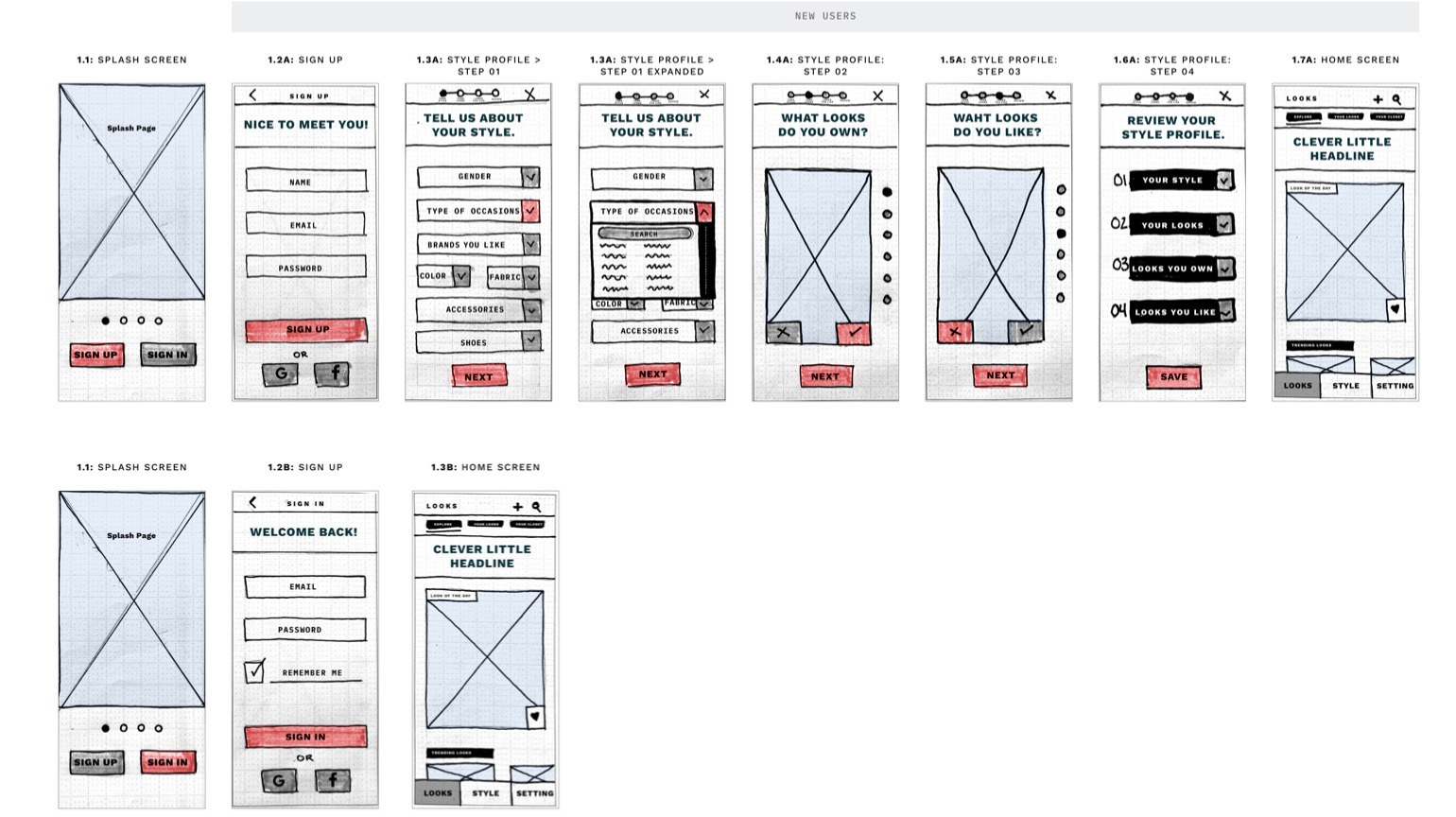
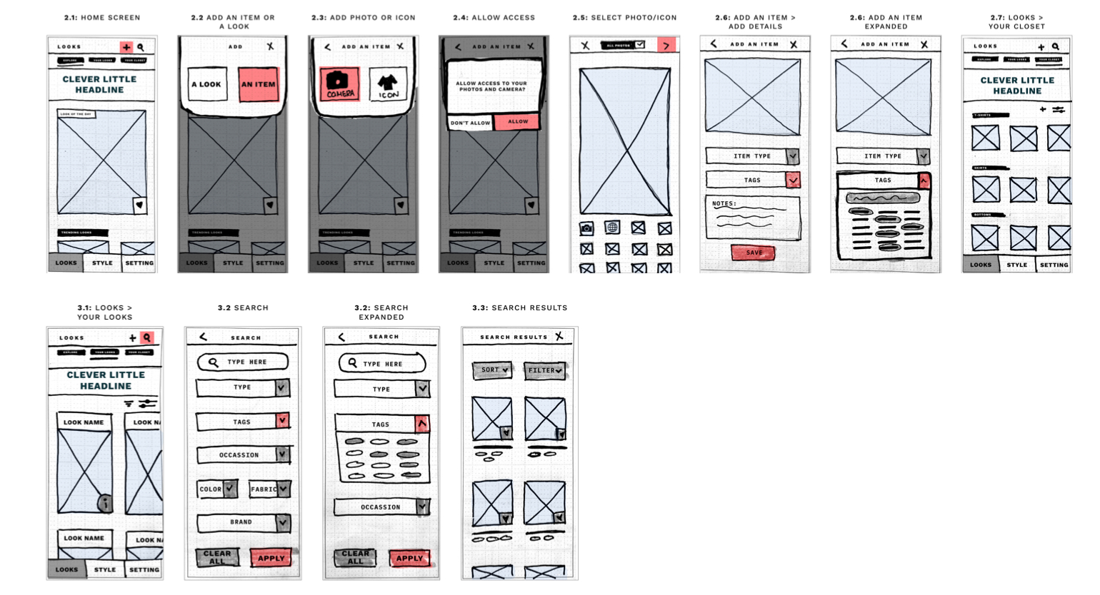
Red Route #1: Sign Up
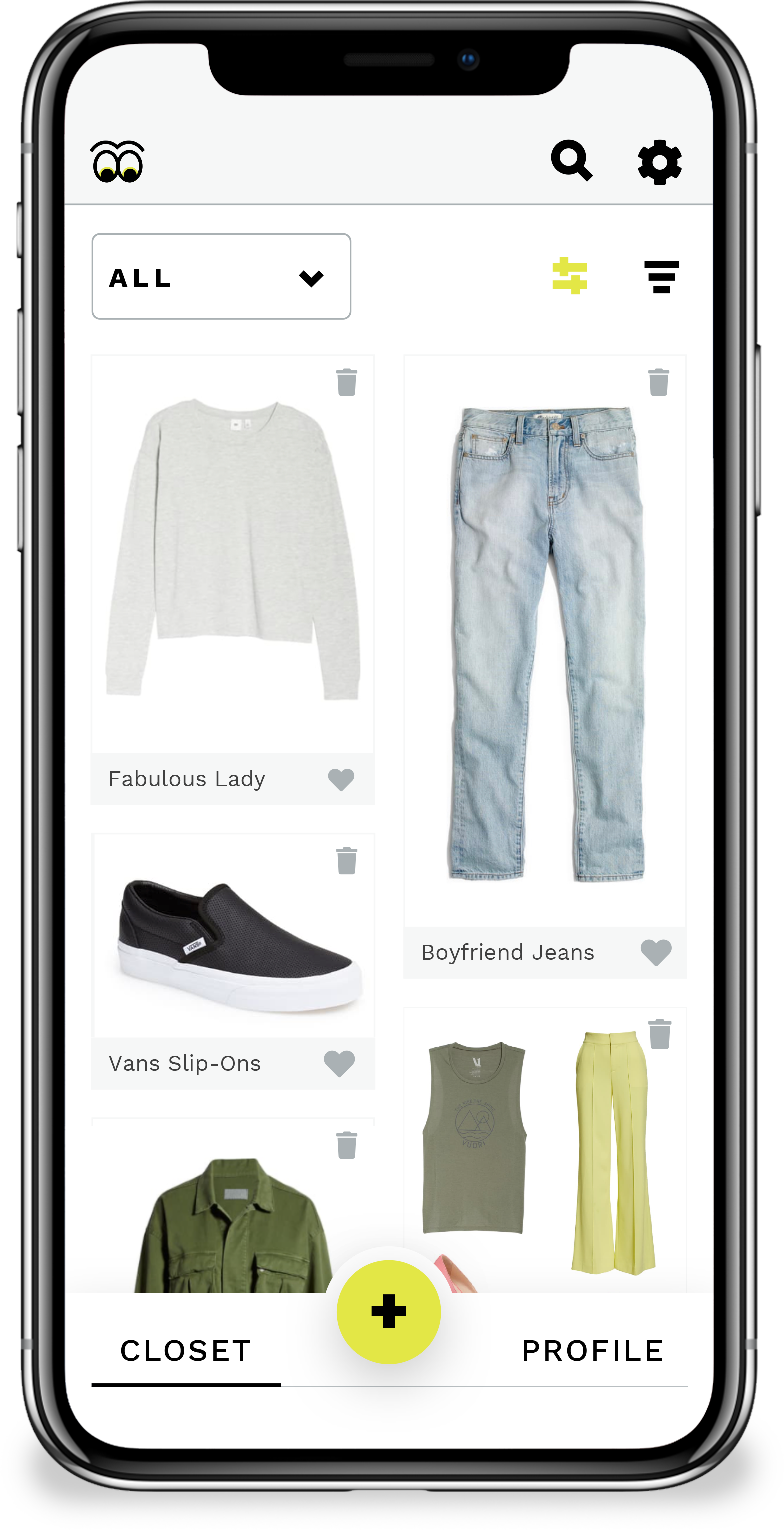
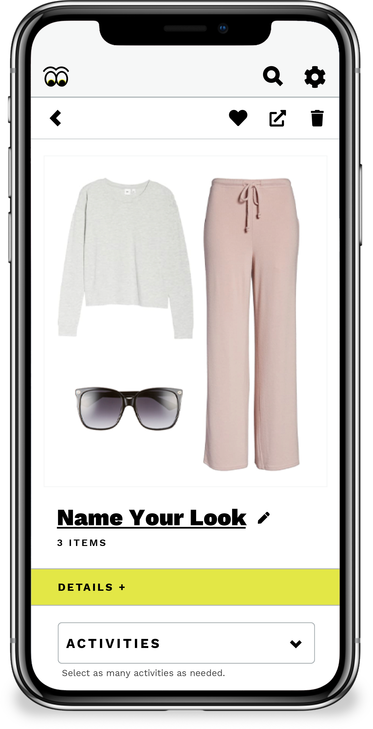
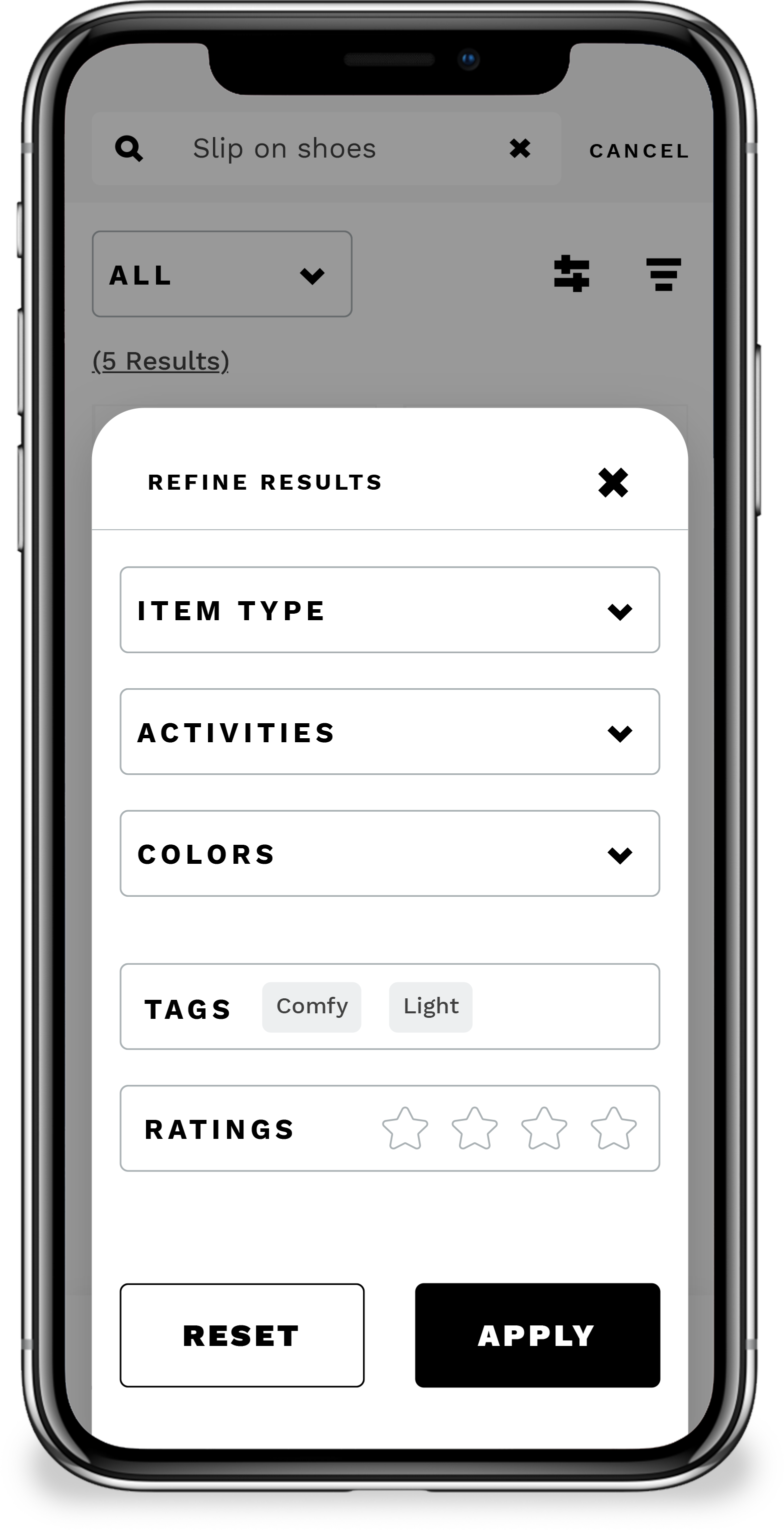
1.0 Designs
STEP 06:
Prototype + Testing.
Prototype 1.0 Result.
My first round of testing involved 5 participants. 4 of the interviews were moderated, and 1 was unmoderated. All of the tests used the prototyping tool InVision and Maze.
The goal of this test was to see how my design decisions affected the participant’s ability to use the app. Specifically, completing the red routes, and their response to design choices, layout, hierarchy, etc.
2.0 Designs + Prototype.
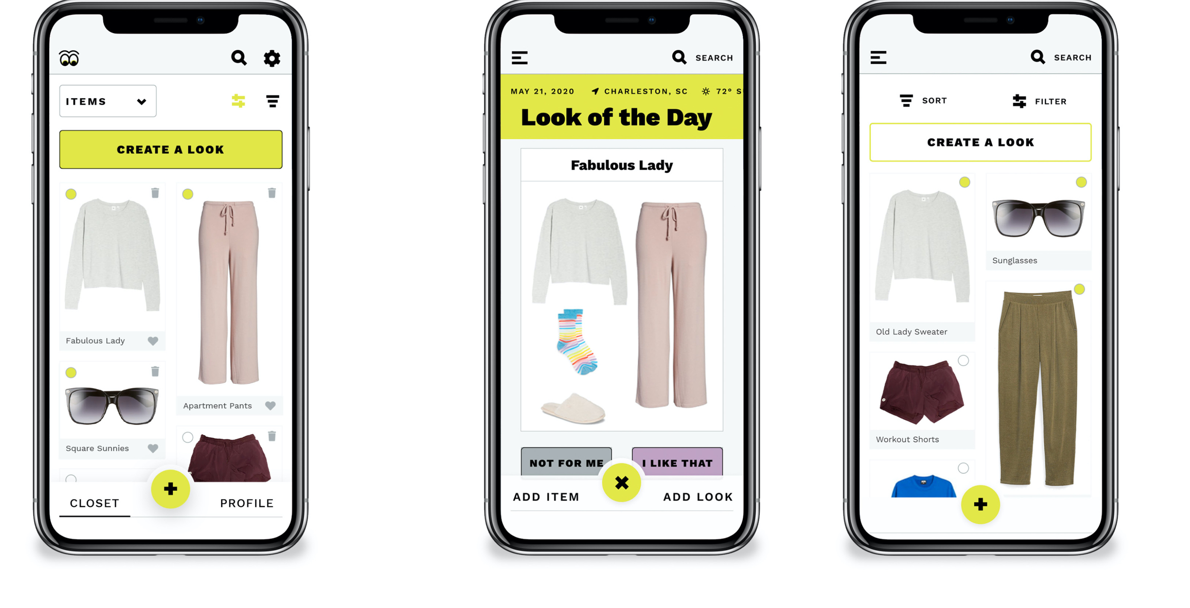
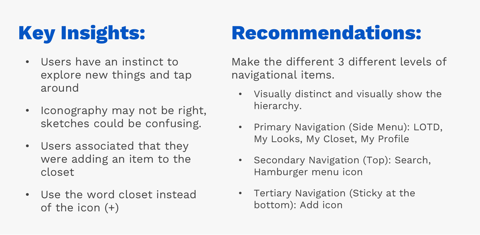
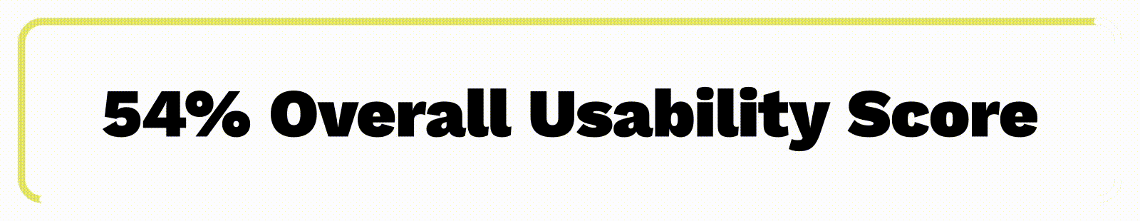
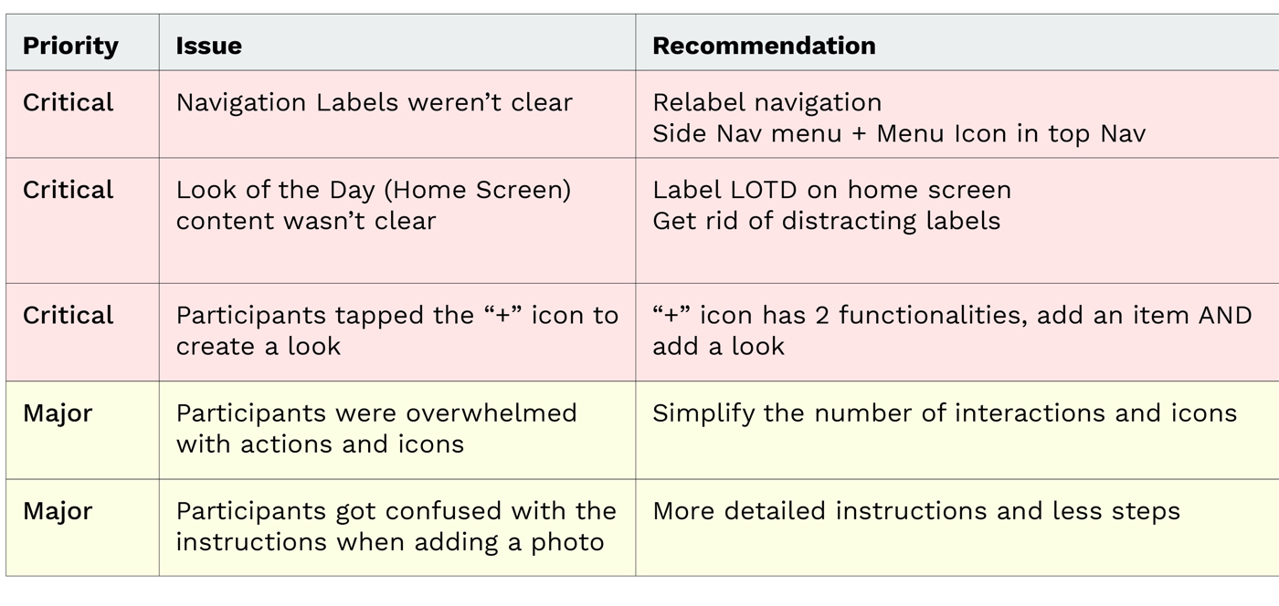
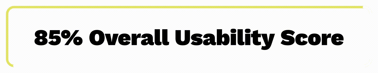
Prototype 2.0 Results.
The second round of testing’s goal was to see if the issues I identified and design improvements did improve the overall usability.
I tested 5 new participants that met the same requirements as the previous 5.
In Summary.
The UX process is iterative and evolving.
While designing the product, it can be easy to get off track, I found myself going back to the empathizing with the user and the initial problem to stay on task.
Due to COVID-19, I wasn't able to conduct in-person user research and interviews. It's ideal to have as much in-person research and interaction with users so that I can pick up on emotional and physical cues that I can’t get remotely.
User-centered design is integral in producing the best product for not only the user but also for the client and stakeholders. It allows me to uncover the motives, emotions, and needs of my target audience. The entire purpose of the product was built off of my research, analysis, and application of what the users want, need, and feel when deciding what to wear.
More Work.

Viva TranslateUX + UI Design
Trike TrekProduct Launch Campaign
GotchaBranding
I am INNOVATIONHealthcare Campaign
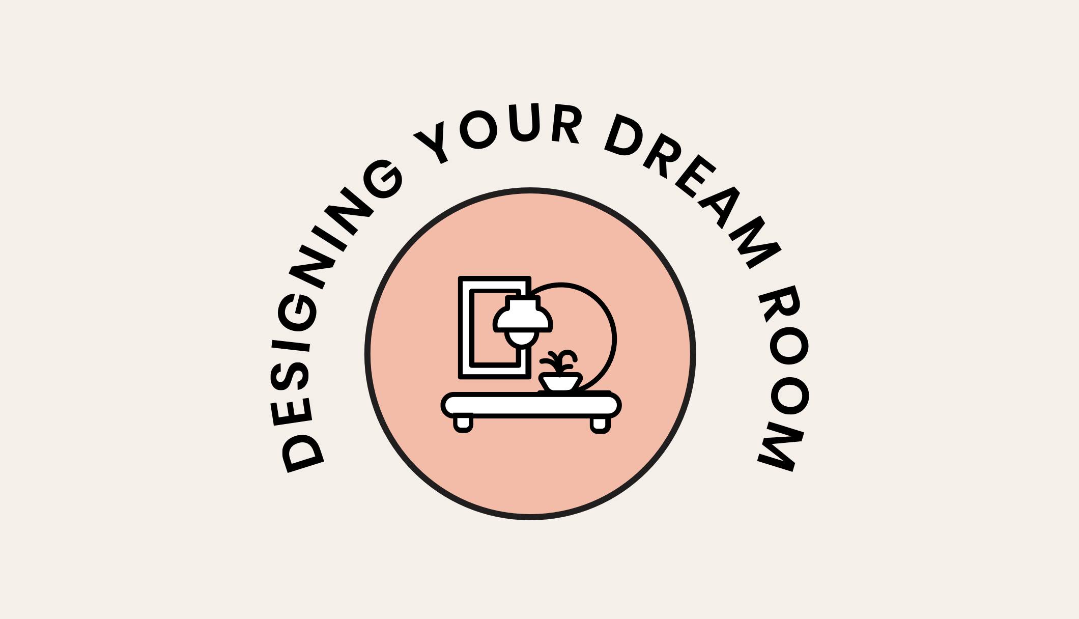
House2HomeUX + UI Design
Kyle CarpenterBranding

Trace Your RootsSC Department of Agriculture Campaign
GilletteWebsite Redesign
Built Around YouB2B Campaign
The Comfort of KnittingA Reflection of Comfort