
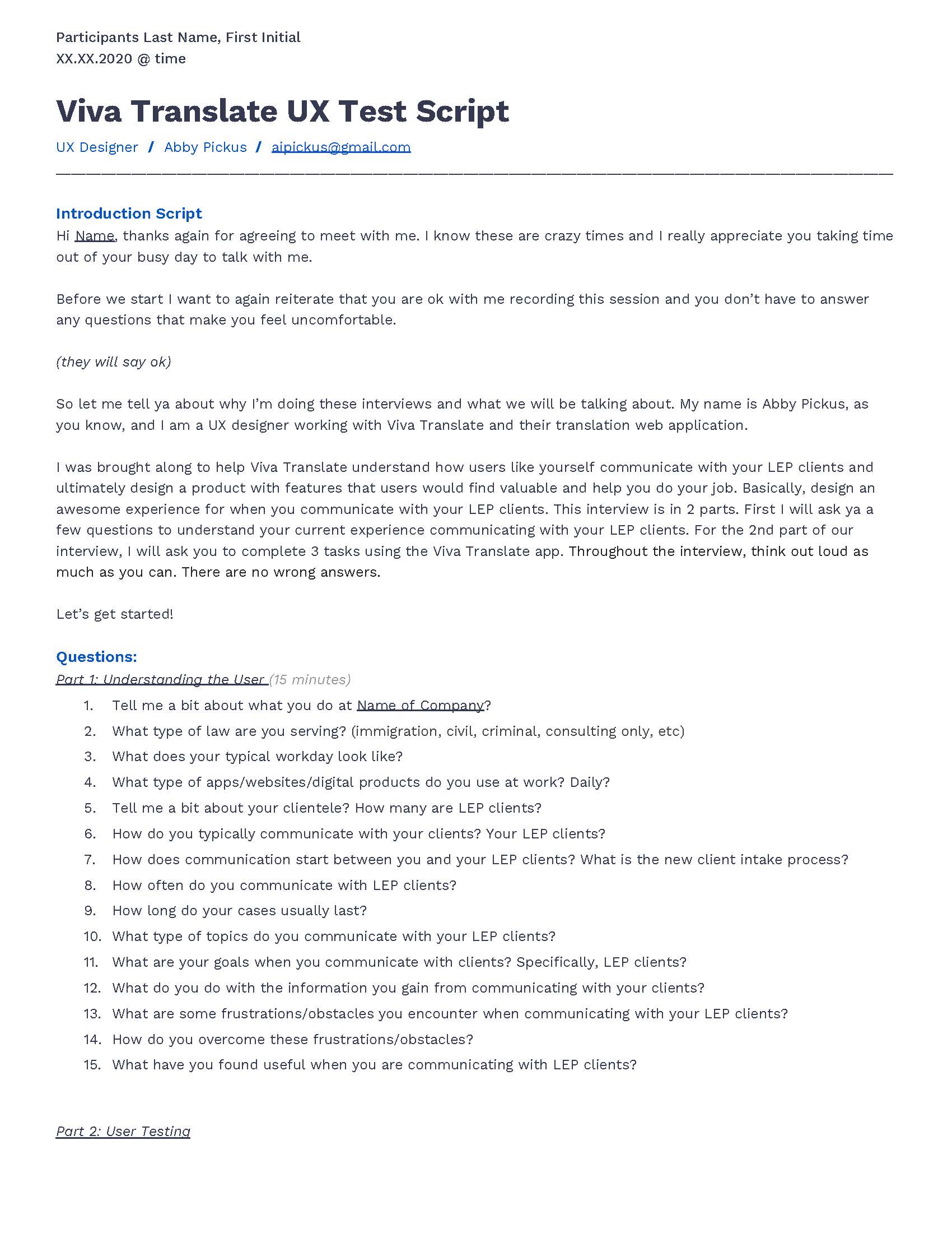
Viva Translate
My Role: UX + UI Designer
My Role: UX + UI Designer
Viva Translate is a web application that automatically translates conversations between attorneys and social service professionals and their limited English proficiency (LEP) clients in a low-tech and convenient way.
While the product is in its beta stage, I was brought on board to provide creative support to better understand the features their users would find most valuable and design an optimal and cohesive user experience and brand.
House2Home (H2H) is an e-commerce website that sells home decor + accessories.
Through customer surveys, House2Home has found that many of their customers have just moved into a new home or apartment and want to personalize their new home. House2Home saw an opportunity to help their customers find a great “starter kit” of items to instantly decorate their new place.
My role was to run a quick modified GV design sprint over 5 days to quickly test out a possible solution.
The
Objective.
01
Identify the additional features that Viva Translate’s primary users would find most valuable.
02
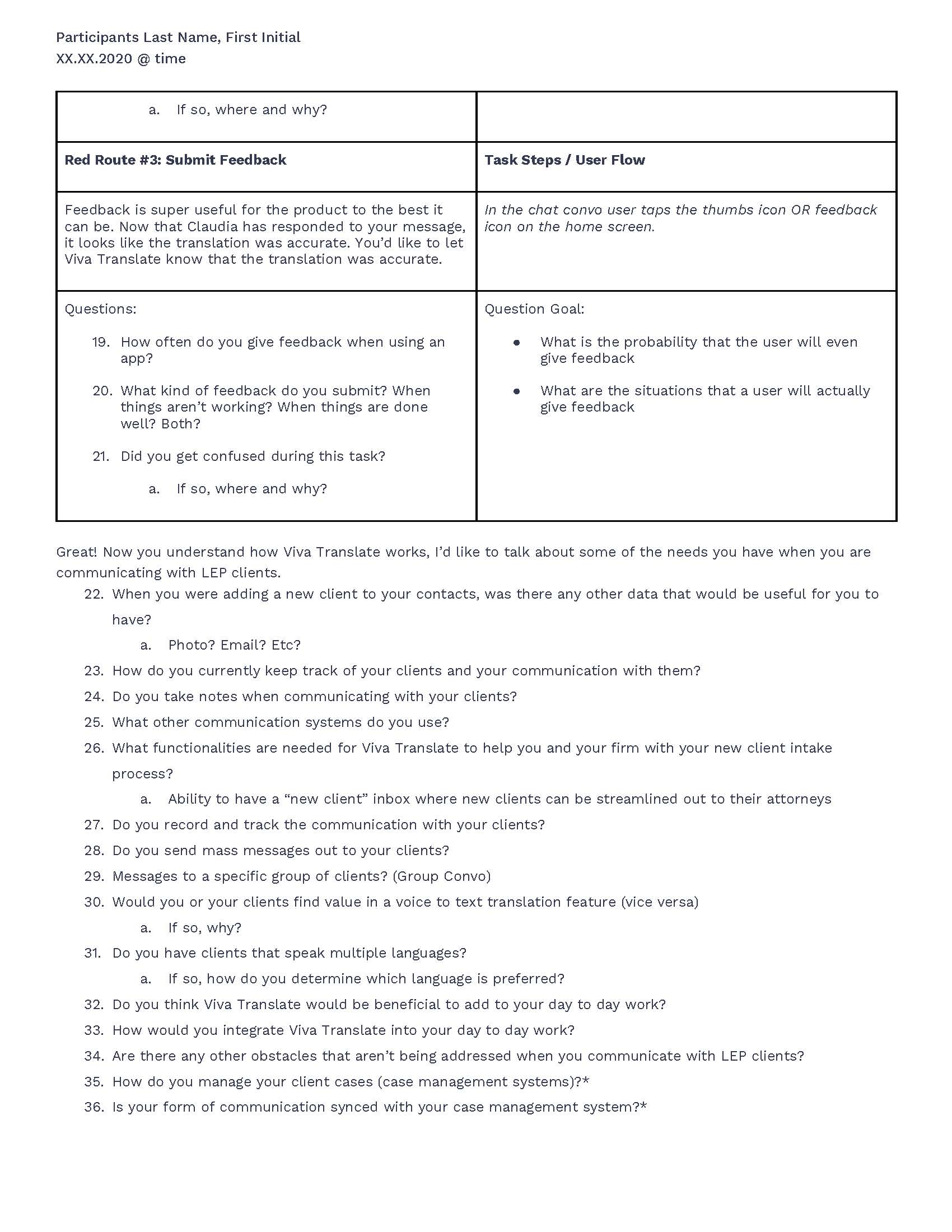
Design the identified features, so their users have an optimal and cohesive experience.
03
Create a polished and cohesive Viva Translate style guide.
The
Product.
Viva Translate is the brainchild of 3 Standford graduates, Belinda Mo, Tony Hua, and Ches Thai. All three are children of non-English speaking immigrants. Growing up, they served as translators (lifelines) for their families and understood the need to bridge the language barrier gap.
Viva Translate_beta.
The initial product was designed around the needs of the Law Foundation of Silicon Valley’s Children & Youth branch, where the majority of incoming clients at the Law Foundation of Silicon Valley do not speak English.
HOW IT WORKS
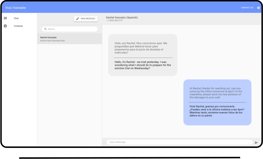
LAWYER
Lawyers use a web application on a desktop or laptop computer to send/receive and manage conversations with multiple clients.
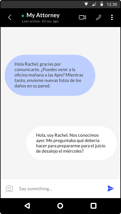
LEP CLIENT
Clients use text messaging or WhatsApp to communicate in their native language, empowwering clients to initiate the conversation.
Viva Translate_beta Audit
I wanted to understand the Viva Translate beta product and how the features and functionalities currently work from a user's perspective.
Primary + Secondary Research.
Conducting primary and secondary research was instrumental in understanding what the business goals were of the client as well as gaining deeper empathy for who they thought their users are.
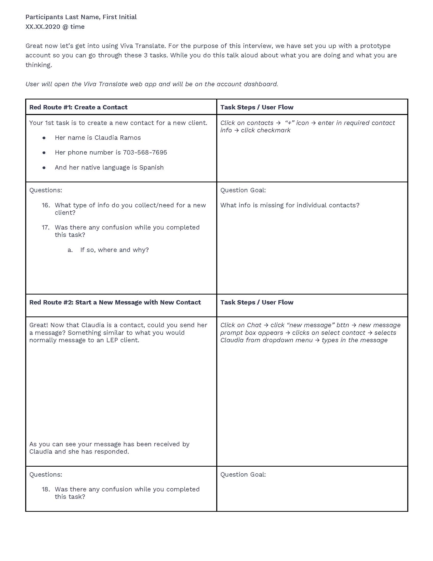
Identifying Red Routes
Red Routes are the top user flows that the user goes through to get to their goal. I identified the top 3 red routes from my primary and secondary research.
RED ROUTE #1
Create/Add a New Contact
RED ROUTE #2
Start a Conversation with the New Contact
RED ROUTE #3
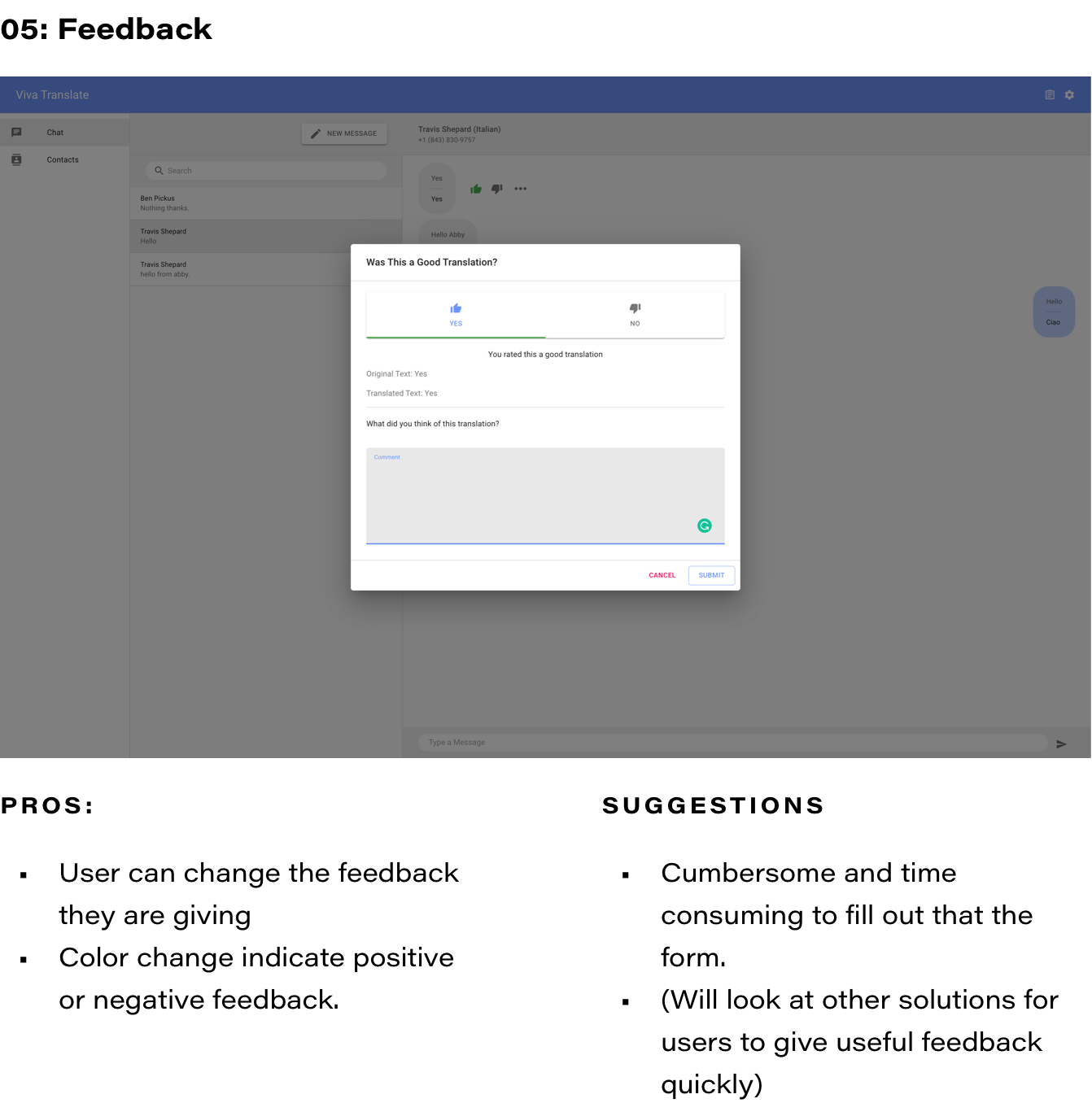
Submit Feedback (on the accuracy of translation and the overall app.)
The
Audience.
Viva Translate technically has 2 users, the attorney, and the LEP client. The attorneys and legal aid are the users that are actually interacting with the product, and it’s an interface, so they are the primary user.
Legal Aid (Primary User)
PAINS:
- Frustrated with how hard it is to reach non-English speaking clients
- Dialing in a translation line can be time-consuming and expensive
- Multilingual staff for uncommon languages is difficult to hire
NEEDS:
- To communicate with non-English speaking clients about straightforward tasks (ie. scheduling in-person meetings)
- Empower their clients to reach out first, if they need help
LEP Clients
PAINS:
- Have limited access to the internet
- Communicate and understand with their legal counsel
NEEDS:
- Clear and comprehensive communication with their legal counsel
- Accessibility to their legal counsel
UX Test Plan.
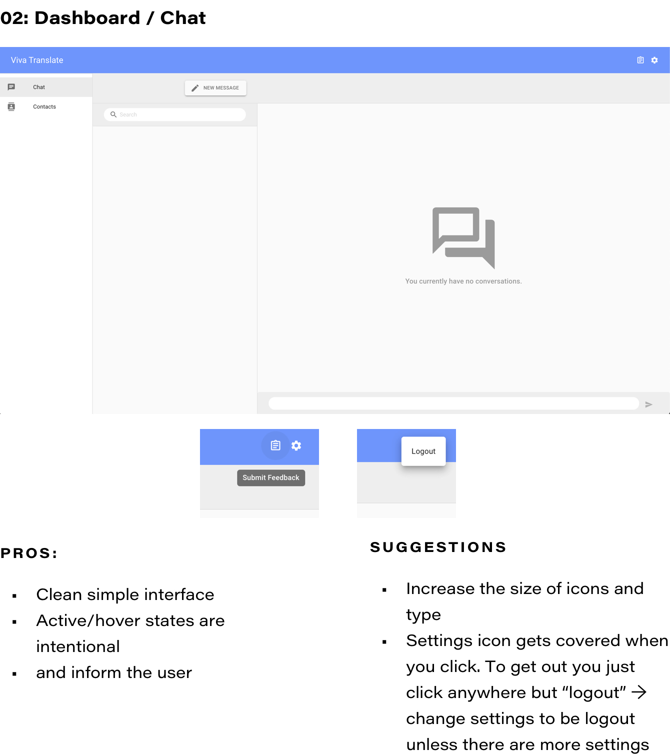
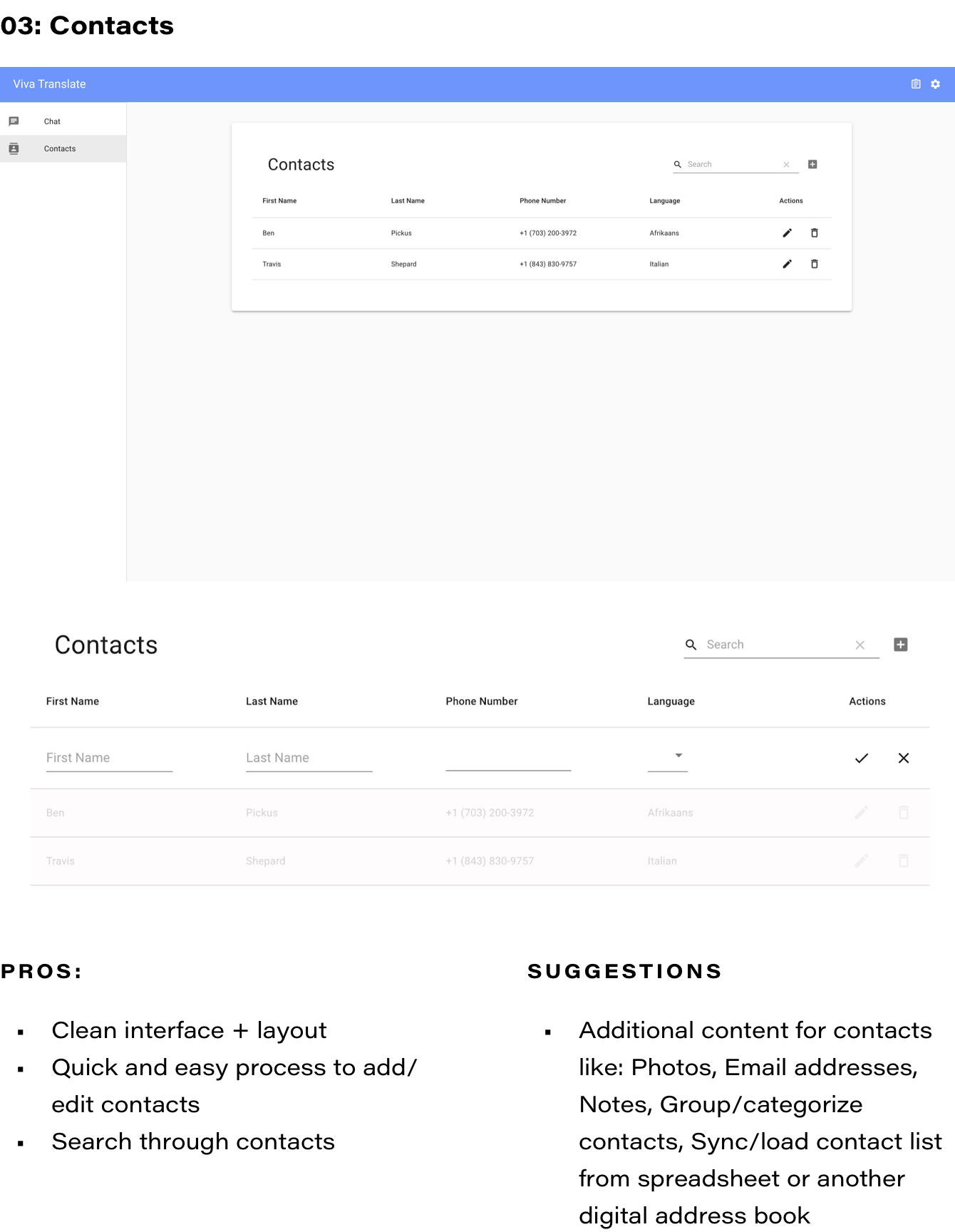
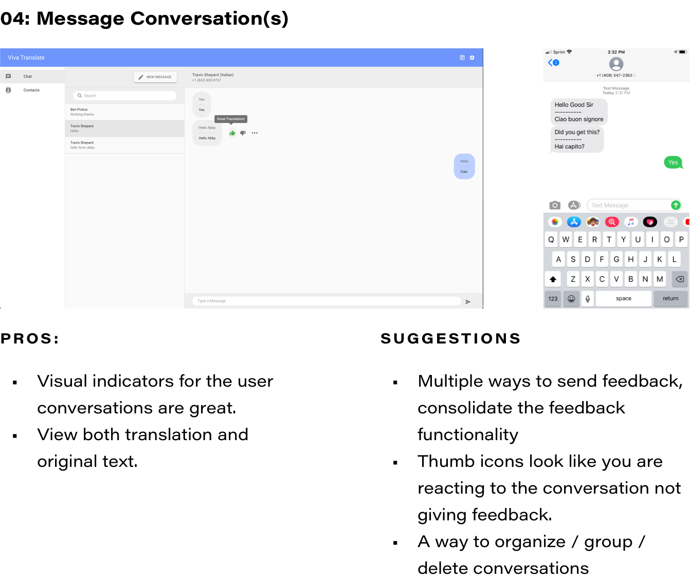
Viva Translates current functionalities are limited to translating messages between lawyers and clients in their contacts, sending feedback to Viva Translate, and adding, editing, deleting contacts. The product has already been successful in empowering LEP clients to communicate with their legal aid services. Through these interviews, we will understand what is working, what needs improvement, and what is missing to ensure optimal user experience.
Participant Characteristics
Outlining the characteristics of the participants guided the participant selection process for the interviews and tests.
- Legal-aid attorneys.
- Participants either:
- Interact with the same clients over a long period of time
- Work on intake teams where they receive 50-500 public inquiries from new clients.
- Interact with the same clients over a long period of time
- Have at least 3 LEP clients.
- Either are new users or are currently using the beta product.
- Work at non-profit, legal aid organizations so their funding for multiple language services is limited.
User Interview Objectives.
Objective #1 -- Understand the User
The first part of the user interviews is to understand the user’s current experience when communicating with LEP clients. From the interviews, the answers to the following questions will be discovered.
- How do users typically communicate with Limited English Proficiency clients?
- How does communication start? Who initiates the conversation
- How often do users interact with LEP clients?
- Where are the users when they communicate with their clients?
What are the user’s goals/motivations when using Viva Translate?
What do users talk about with their LEP clients?
What are some obstacles that the user encounters when communicating with LEP clients?
Objective #2 -- User Test
The objective of part 2 is to understand how the participant interacts with Viva Translate’s current features and identify additional features that the participant would find most valuable.
- Can users complete the 3 red route tasks?
- How did users respond to the 2 red routes?
- Understand how users feel about possible new features, such as:
- New client intake process
- Sending feedback (about the translation and the product)
- Syncing with Viva Translate account
- Mass Communication
- Communication Dashboard
- Voice to Text / Text to Voice
- Individual Conversations/Messages
- Responsive design
- Contacts
- Document translation
- Would users integrate Viva Translate into their workdays?
- Would it be easy to add into their workdays?
- What would they have to learn/overcome to use Viva Translate?
- What current features in Viva Translate would help them
- communicate with their LEP clients?
- What are some obstacles that aren’t being addressed when you communicate with LEP clients?
User Interviews
+ Testing.
The interviews were based on a custom script. Each question was formatted, so the participant would say what they are doing and explain why, giving me more insight and empathy into their point of view.
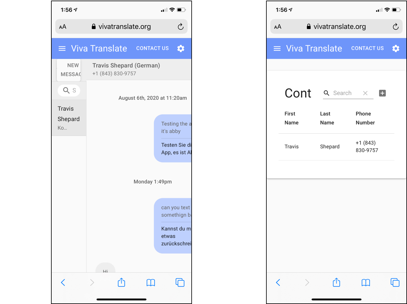
User Interview + Test Sample Transcript.
Analysis.
Once the interviews had concluded, I had to go through my notes, recordings, and transcripts to synthesize and analyze what the users were actually thinking and feeling. I employed 2 UX tools to help organize and synthesize my findings.
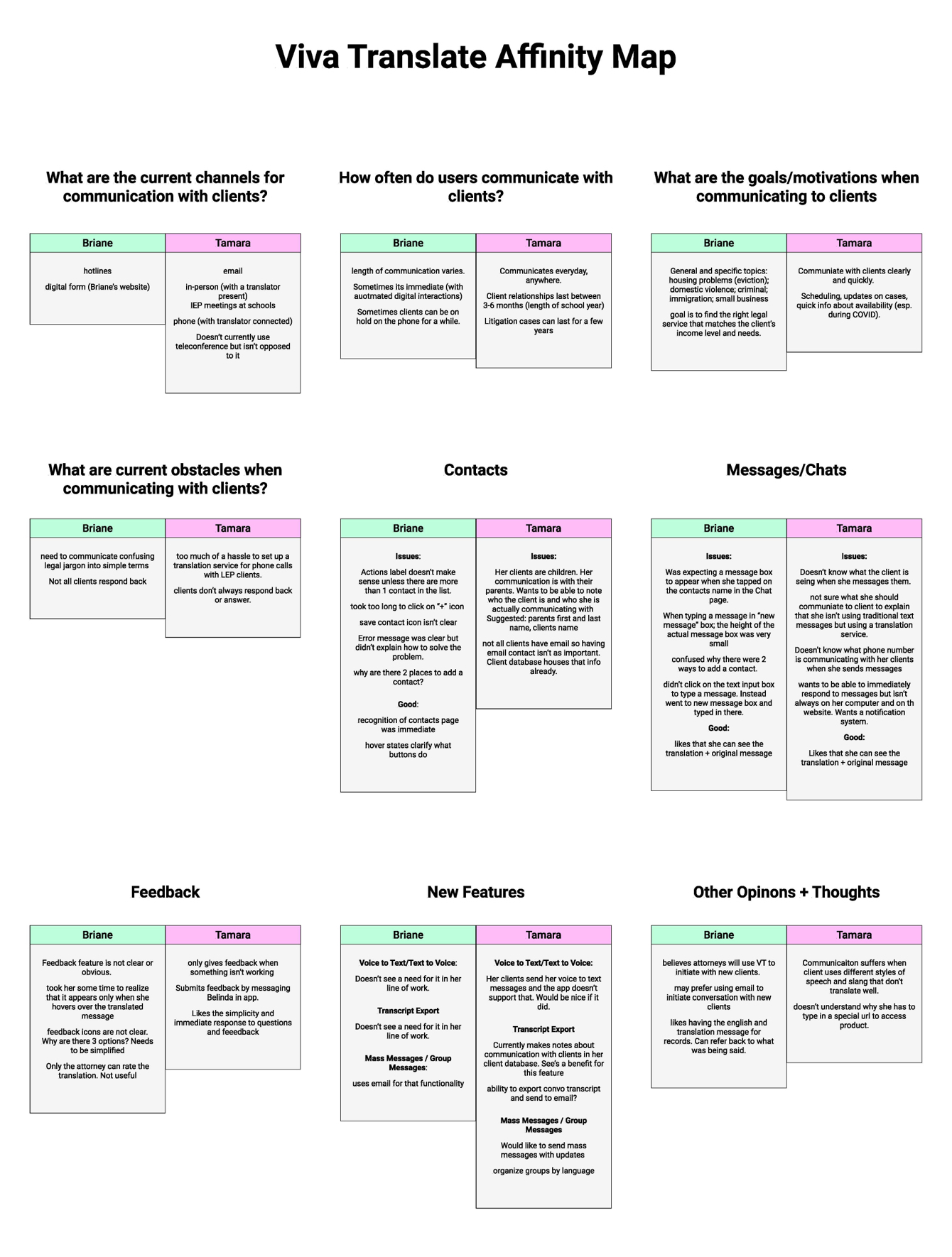
Affinity Map
After conducting the interviews,
I went through my notes and created an affinity map to see trends and patterns and, ultimately, insights.
User Stories
Another tool I utilized was user mapping and creating user stories. This method of identifying the user’s issues and rephrasing them as How Might We statements and ultimately crafting solutions helped keep a high-level mindset.
The user stories helped me identify that the minimal viable product/feature that Viva Translate should offer is using the web application on mobile.
The
Design.
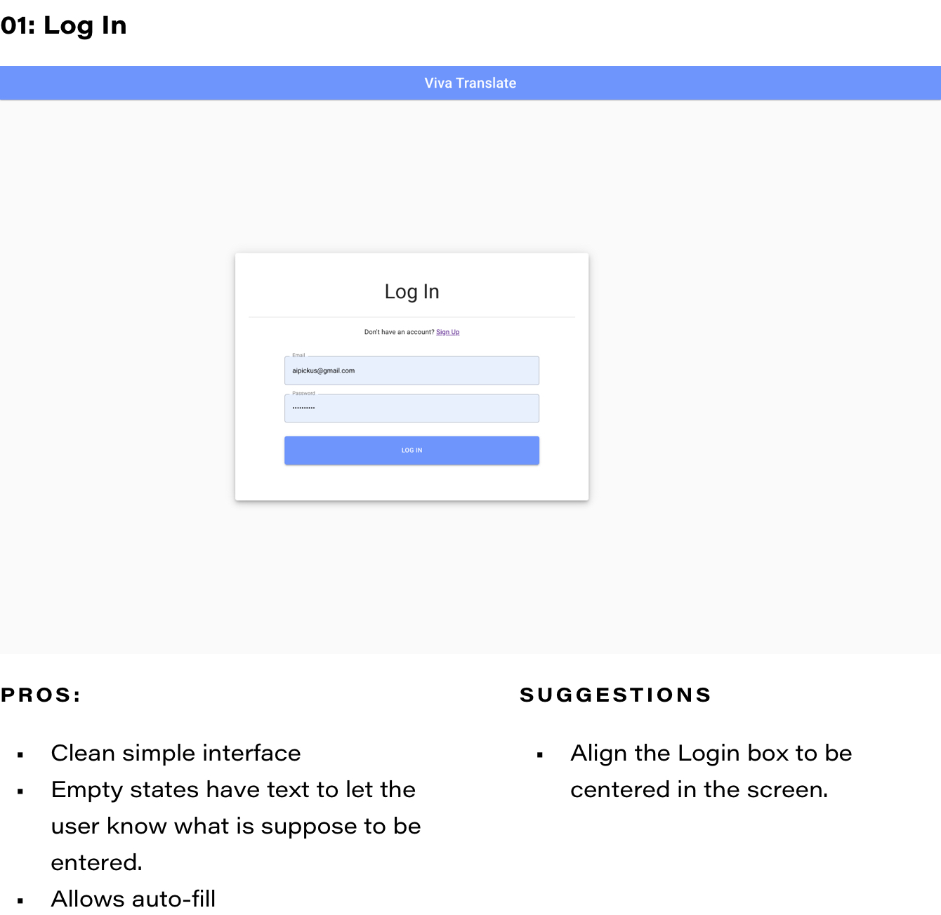
Viva Translate already had brand elements and even a new logo, but none was implemented into the current design. I took inspiration from their old design as well as seeing what other messaging apps do.
Designing Mobile First
This was an interesting case because while
I was conducting my user interviews; the Viva Translate team was actively redesigning the desktop version of their website app. I decided the best course of action was to design their product using mobile-first design—this way, their UI elements can be established and easily applied to their desktop version.
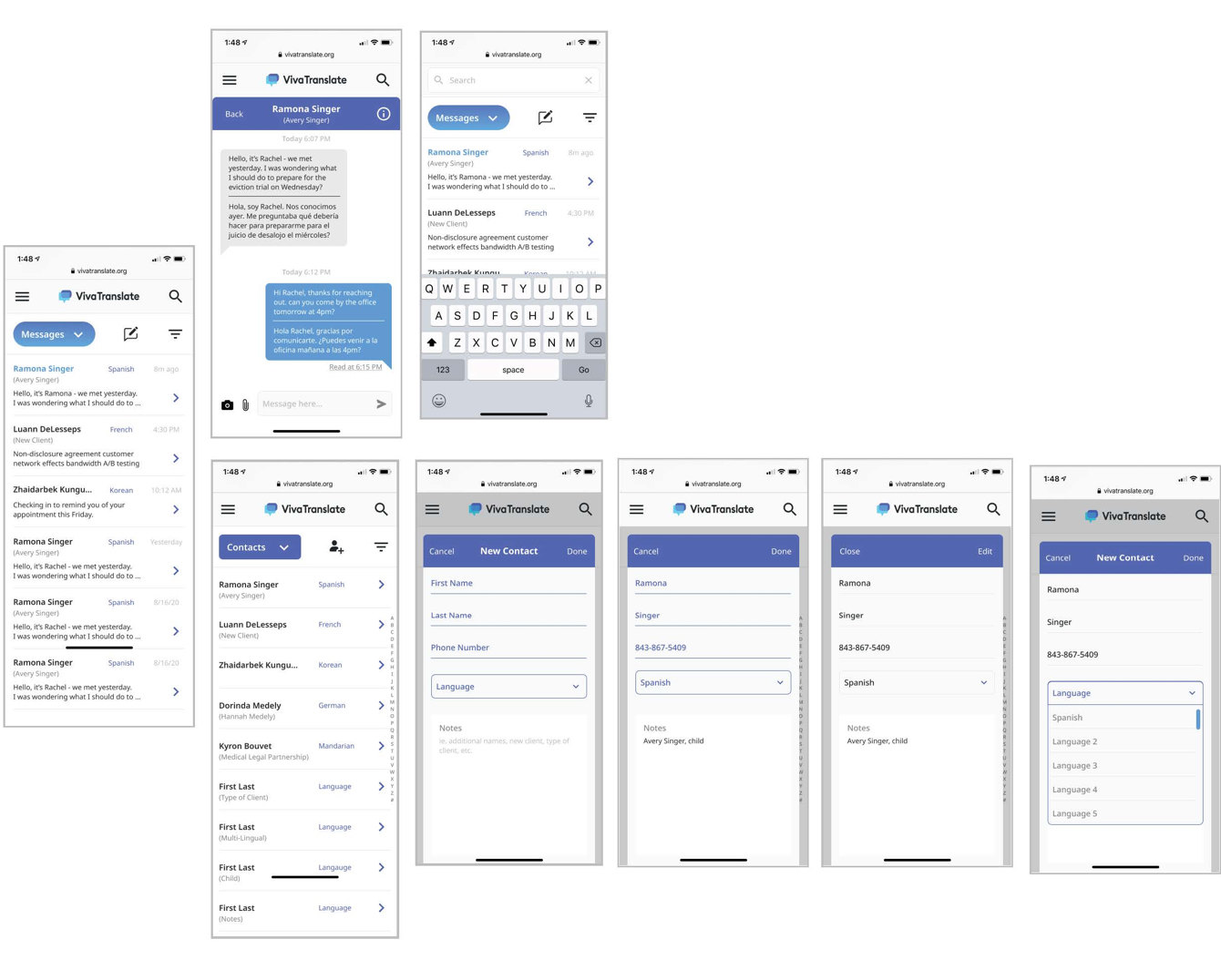
Viva Translate_Beta Mobile Design
Design 01
My goal with the first design was to gain insight into what parts of the brand the stakeholders liked and didn’t like and update their design to meet the UX best practices.
Design 02
Viva Translate’s feedback was that the layout and hierarchy worked, but the overall design didn’t delight. With my second iteration, I wanted to bring more joy to the design without sacrificing clarity. After all, this is a product that makes communicating better and clearer.
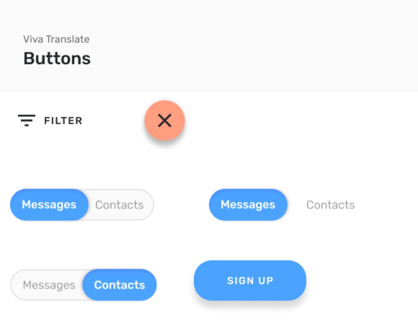
Homescreen
I kept the tabs to the 2 main screens (messages and contacts) at the top as well as a filter feature so users can quickly pull specific messages and contacts up.
Create a new message (or contact) that is conveniently located at the bottom by the user’s thumb.
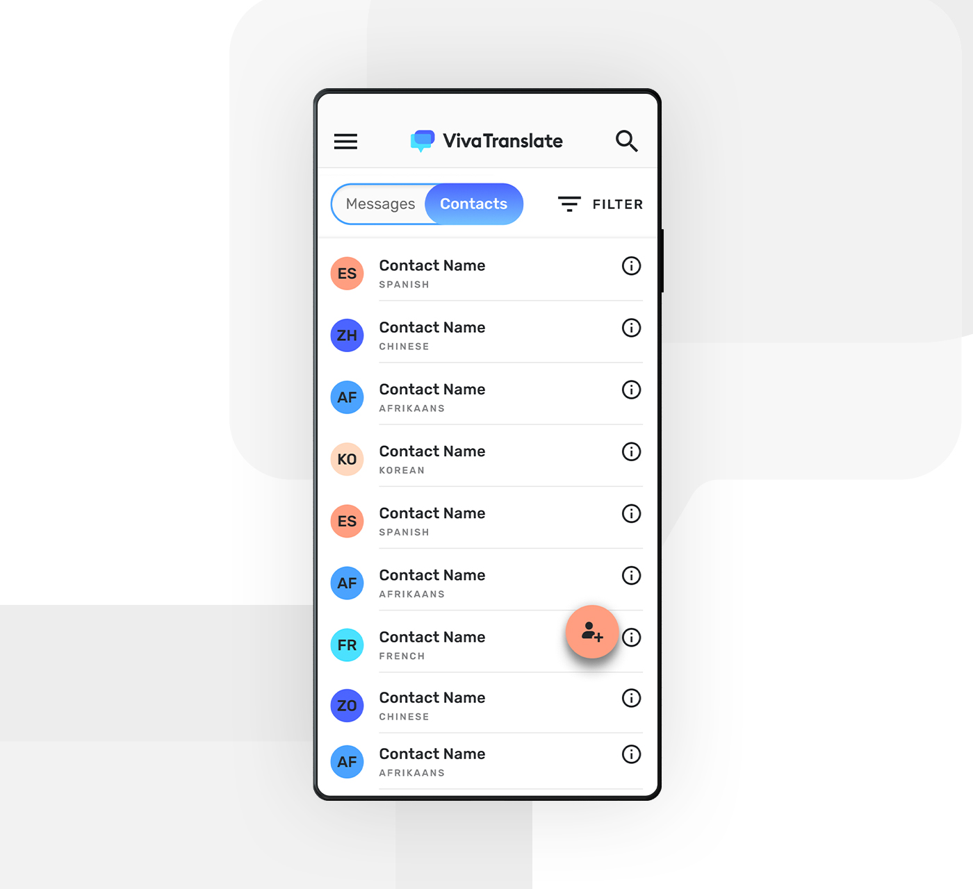
Contacts Screen
I utilized a color-coded system for the different languages that each client spoke so users can easily locate specific clients.
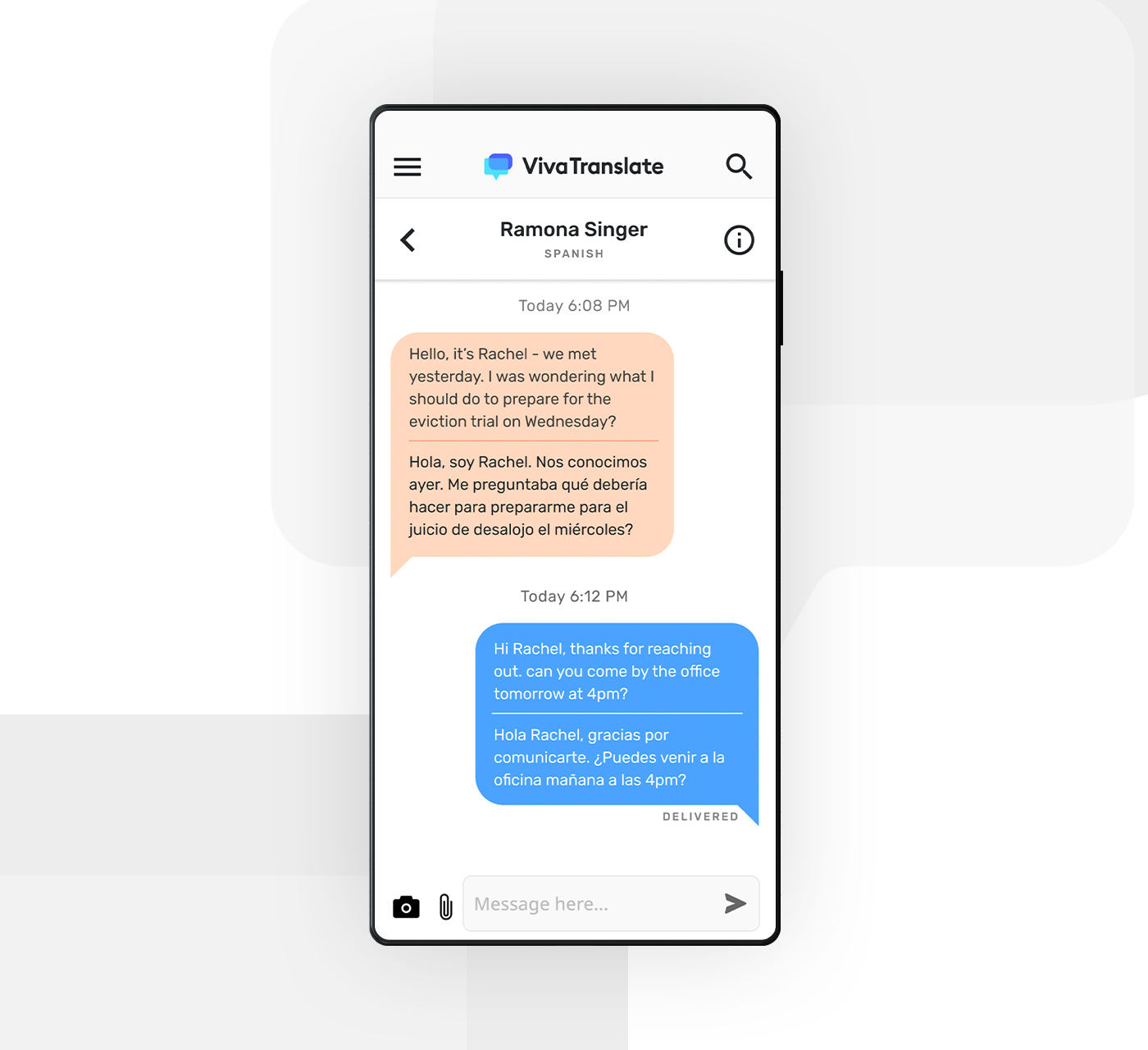
Chat Screen
The contact name and primary language are clearly labeled at the top. It was important to Viva Translate that their translations are correct, so since they don’t have the capability to do read receipts or for the LEP clients to see the accuracy of the translation, I added a notification that the message was delivered. This way the user will know if there was an issue with the translation if they didn’t hear back.
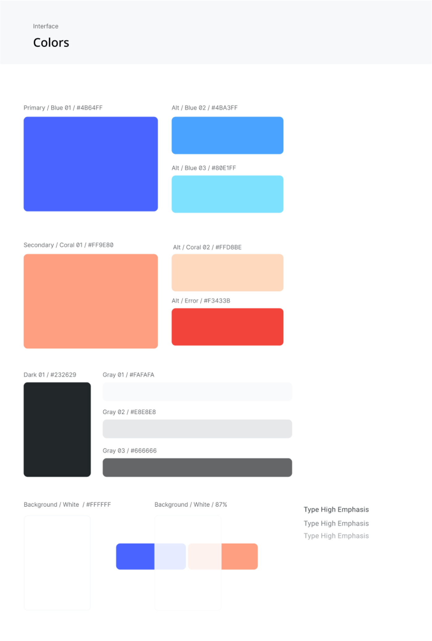
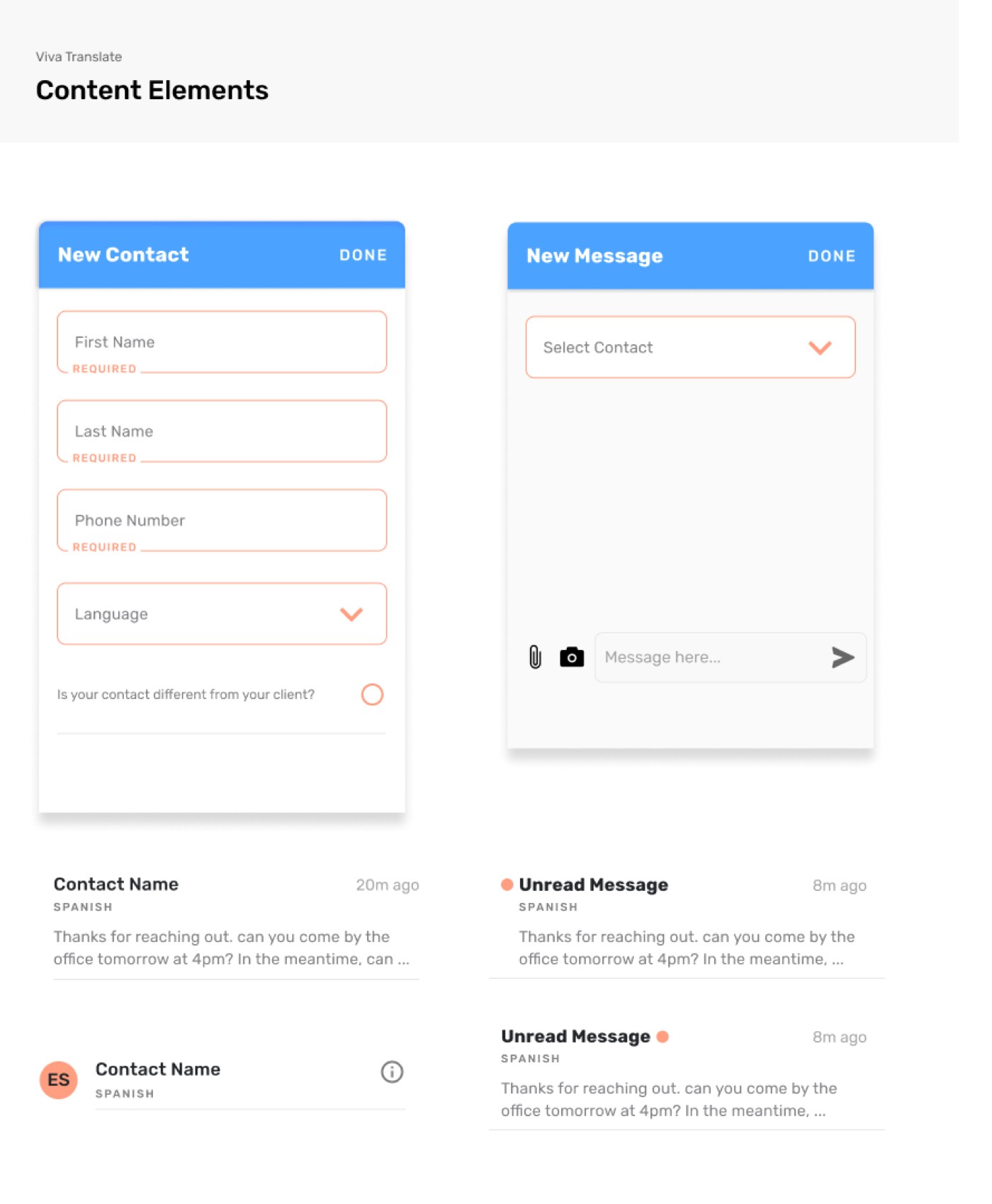
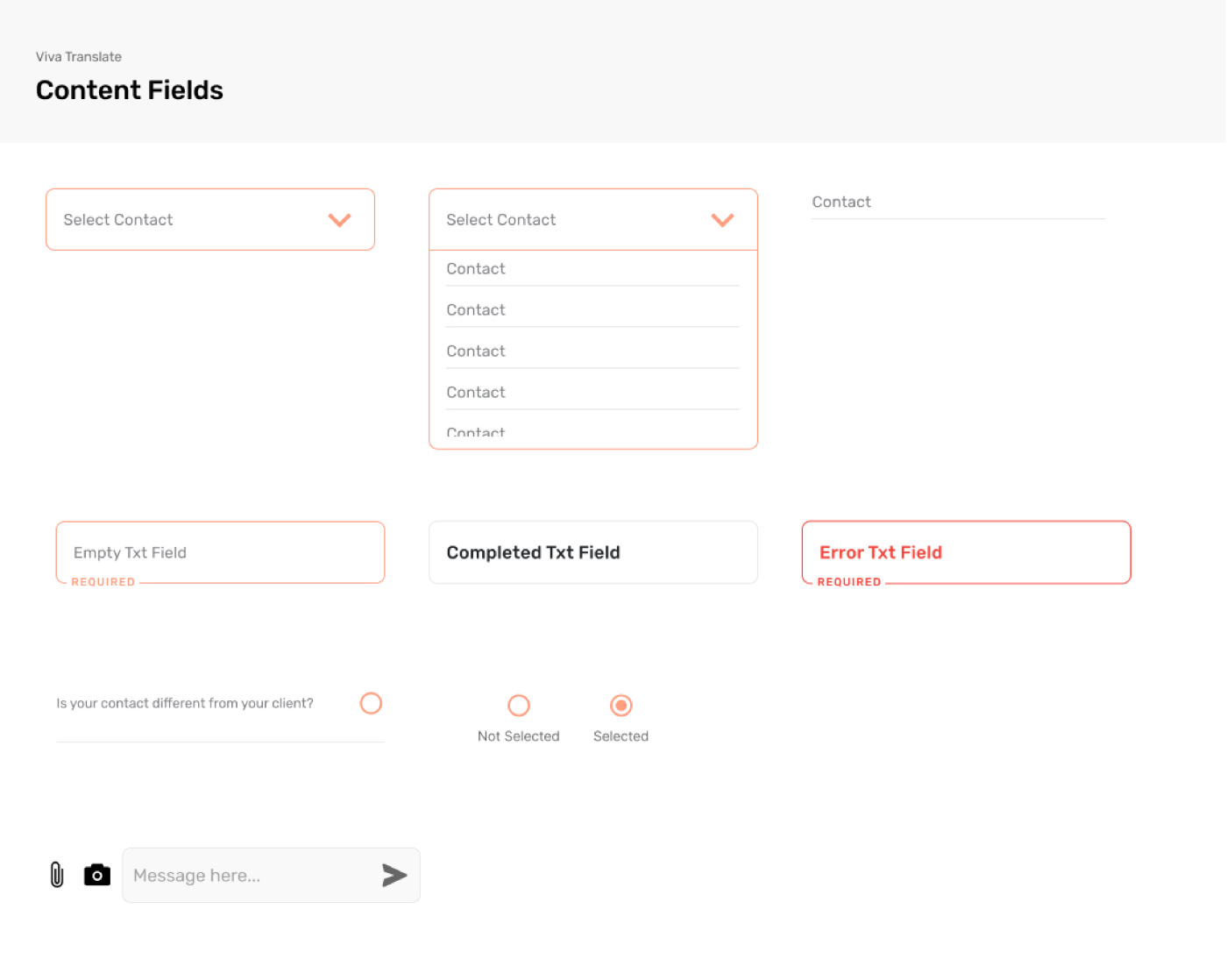
The Design System
My last deliverable was to package the new design into a clear and concise style guide.
Final
Thoughts.
This experience was very enlightening. I got to mix my new found skill of UX design and thinking with my passion for design and UI. It felt good to partner with a company that wanted to improve the world, and I was happy to be a part of that. Looking back I’ve learned how important constant communication with the client and all players in the game is. I found myself worried that I may come off too pushy or too communicative but I’m glad I was persistent in sharing my status and thoughts as we went through the project.
If I had more time to complete this project, I would increase the available time I had to conduct user interviews and tests. Due to the tight timeline, I only was able to conduct 2 interviews even though my goal was 4-5. I also would have conducted more stakeholder interviews to gain a better understanding of what Viva Translate wants to achieve in the long run, but their current status and immediate goals. I would also conduct user testing with the prototype I designed.
Overall I think this was a great experience and I’m excited to see where Viva Translate goes in the future.
More Work.

Look of the DayUX + UI Design
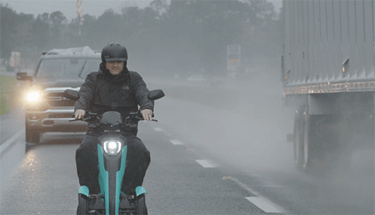
Trike TrekProduct Launch Campaign
GotchaBranding

I am INNOVATIONHealthcare Campaign
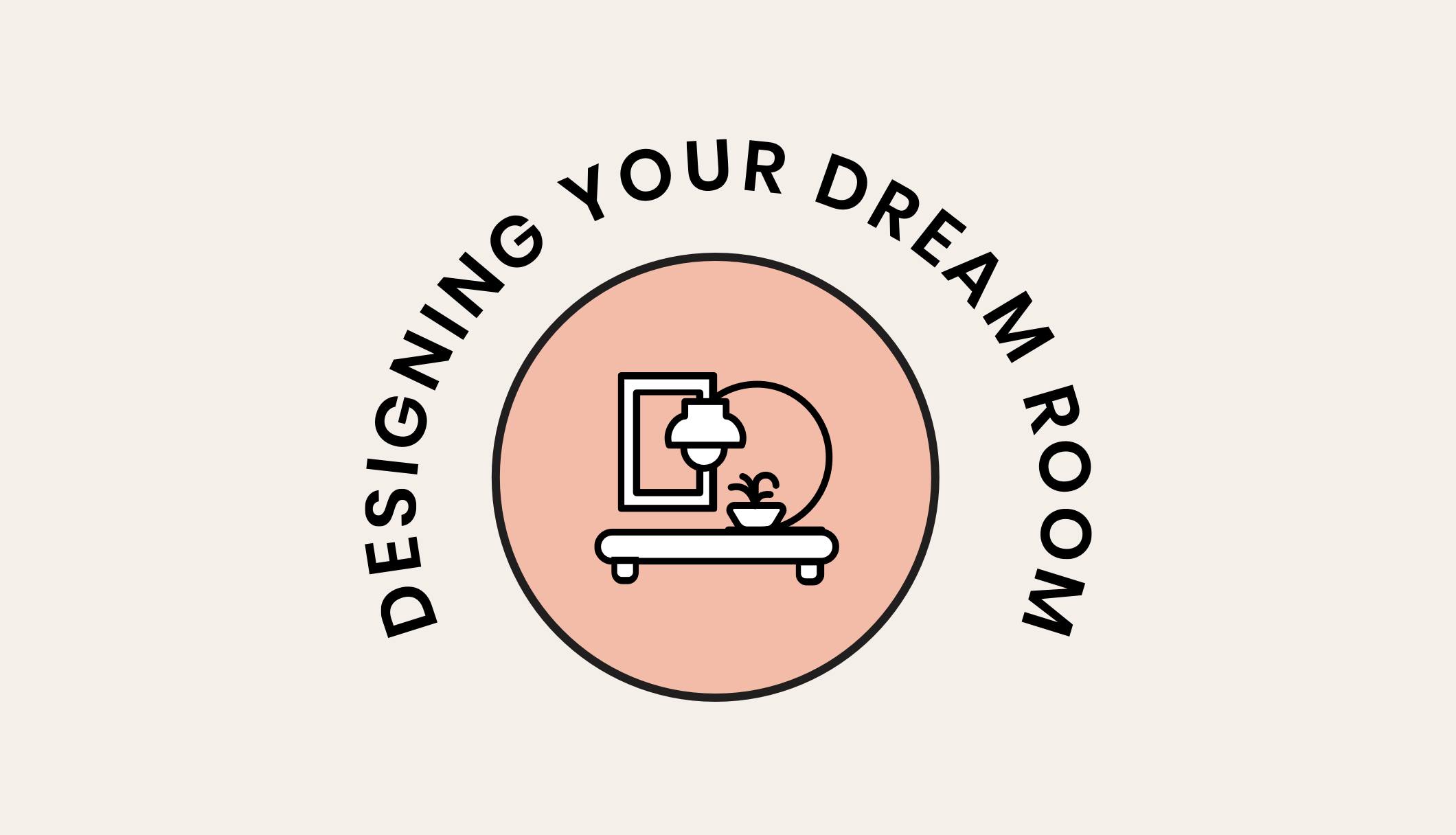
House2HomeUX + UI Design
Kyle CarpenterBranding

Trace Your RootsSC Department of Agriculture Campaign
GilletteWebsite Redesign

Built Around YouB2B Campaign

The Comfort of KnittingA Reflection of Comfort